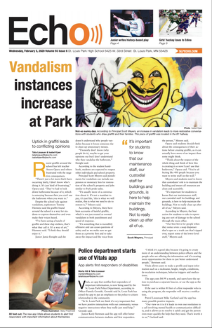
Lissauer and co-editor-in-chief Maddie Schutte on-screen an opinions page. Before sending to the printer, Lissauer, Schutte and advisor Lori Keekley read every page. Lissauer screen shares each page to follow COVID-19 restrictions.
Design
News
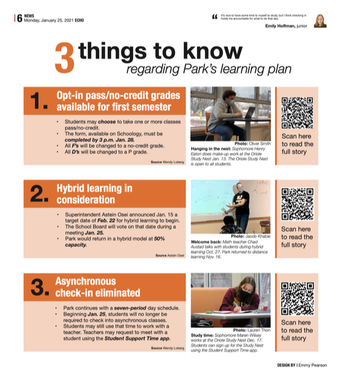
My first semester on staff I designed a page every cycle. Despite my limited experience and knowledge in the artistic world, I always listened closely to the design editors to ensure I was always learning new skills. When I was news editor, I worked with design editors to come up with a design that worked for the content on the page. Even though design was never a strong suit of mine, I still took the time to listen and learn as much as I could.
At the start of late night, nothing — including the stories — was ready to go for this page. For how quickly it was done, I am happy with how the page turned out, but I wish we would have been more creative with the way the headline looks. |
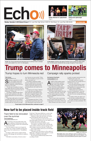
For this design, I knew we had to balance the two opinions of former president Donald Trump holding a rally in Minnesota. I love the way this page turned out because, while the design is simple, the cut outs in the photos add an eye catching element to the page. |
The switch to newsmagazine
|
As soon as it became clear Park would be returning in a hybrid model, we decided to switch from a newspaper to newsmagazine. This meant redesigning and rethinking everything we do for print. We spent the first few months of the school year working on the big picture aspects like the placement of folios, formatting, table of content and the nameplate. After winter break, we still didn’t know when we were going to come back in-person to school so we decided to set a date two and a half weeks into the future to upload a PDF version of our first newsmag. This came at the end of the semester, so I, along with the rest of the staff, had to balance a heavier than normal workload with creating a newsmagazine for the first time.
The next two weeks were spent on Zoom every night meeting with designers to go over the pages, helping them when they were stuck and giving advice. I had never put together a print issue over Zoom, but many staffers had never put together a print issue at all — and I was happy to help. By the end of the two weeks I felt more comfortable than ever with InDesign. |
|
As the day we were going to upload the newsmagazine approached more and more news stories came in that had important information that should be on print. Instead of squeezing three stories onto one page, I pulled out the key facts that students and staff needed to know and worked with a fellow staffer to place them on the page while making it easy to read.
|
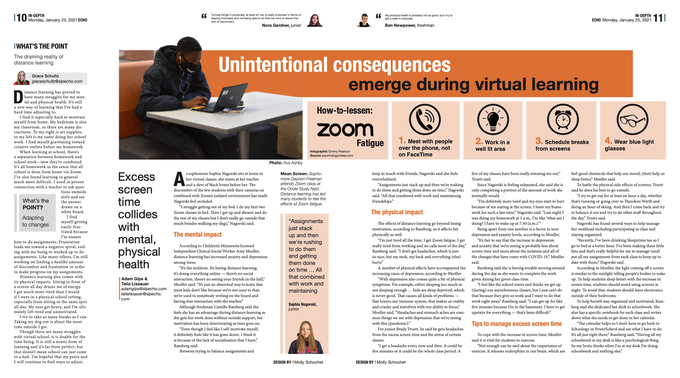
While I worked with all of the pages, I spent a lot of time working on our center spread. I worked with the designer through the whole process from inspiration to PDFing. Everytime the designer was confused (most commonly with text wrap), she sent me the file and I screen shared on Zoom to explain how to do it. We struggled to make sure the page was more than just text and was visually interesting. We ended up using the infographic as a visual element to help draw in the reader.
|
While finalizing pages the day we were sending to the printer for our second issue, we decided to redesign a majority of this page. The design editors were too busy to do it so I stepped in to do it. I surprised myself with how quickly and well I completed it.
|
As chief, I see my job as stepping in where help is needed. Just three days before we were sending pages to the printer, there was no plan for this page. I struggled to find a way to highlight every photo while keeping them all different sizes. But, I am so happy with how it turned out.
|
Web
|
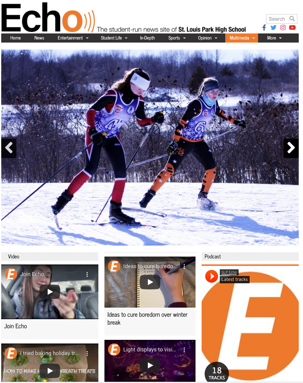
"What is the best way to show this story?” That question has been drilled into my head since my first day on staff. The idea behind it is that some content may be better presented in a podcast, video or photo gallery as opposed to just a story. I love that we focus on this as a staff, but it always bothered me that those elements were not highlighted the same when it comes to posting content on our website. So, along with the web editor, I added a multimedia tab on our website so our viewers can easily find and view all of those multimedia elements. When designing the multimedia tab, I put the photo galleries big at the top because usually our best photos are the first ones on a photo gallery so I wanted to highlight them. Before we added this page there wasn’t a way to find all of our photo galleries together, but now there is. Under the video category on the home page, you can only see the most recent video, I wanted to change that to show more than that as our video coverage has a variety of content. When designing the new multimedia page, I made podcasts tab more accessible to our readers because previously they were only featured at the bottom of the home page. |
